The modern digital world works on the engine of data. Businesses generate and consume large amounts of it in the hope to discover ‘a-ha!’ moments, learn things from killer analytics, and make data-driven decisions. However, one can’t embrace the true bigness of big data—it’s not immediately meaningful. Before the concept is created in a human’s head, it just… doesn’t exist.
Visuals are able to conjure up a certain concept instantly by cutting noise and telling a story. Stories captivate people and create strong ties between multiple concepts. When data is visualized, anyone in the company is able to interpret it, i.e. see trends, patterns, and outliers as well as spot important correlations and relationships between thousands of variables. In the big data world, visualization technologies are a staple of data storytelling as they present massive amounts of data in a way that is not overwhelming.
Data visualizations don’t equal to just flashing a few pie charts that should somehow bring powerful insights. The choice of a visualization technique depends on the goal. However, before we talk about the techniques and their goals, mind the trap you can get into. In pursuit of sophisticated visualizations, you can fail to deliver the message. An effective data visualization is a balance between form and function. A stunning infographic can fail to convey the right message while a plain table will speak volumes. Thus, data and its visual representation should work together.
Curiously enough, out of all the facets of data analytics, companies don’t treat data visualization as a priority. They wonder, is data visualization the answer to all their business problems? When paired with predictive and prescriptive analytics, then yes, it is.
Let’s see how different types of data visualization help businesses grasp whatever amount of data they have and use it for various purposes, such as getting better visibility into operational processes or making data insightful for different departments.
Common visualization techniques, for data small and big
Below, we describe a set of basic visualization techniques that work with different kinds of data, including big data. Of course, big data poses additional challenges, but decision makers still need to read the data’s story, i.e. see it in the digestible formats they are accustomed to.
Here’s a guide to help you choose the right visualization technique for your data. Before you drill into it, note a few useful visualization tips:
- Use easy-to-digest numbers, e.g., instead of 10.000.000 use 10, with the clarification that numbers are indicated in millions.
- Provide context for values, particularly where it’s hard to comprehend them visually without additional information.
- Use color-coded metrics where applicable. It can be as simple as green-yellow-red, but people can subconsciously interpret similar color associations.
Technique 1. Charts
Charts are usually used to show the dynamics of one or several data sets.
Line chart
Line charts are most efficient to show the relationships between variables. They are usually used to demonstrate changes and trends or to compare multiple components over a certain period of time. A few lines are used to match the values of a few trends or variables.
When to use?
When you need to show the relationship between data points, not just a number of data points you happen to have. For example, you can visualize customer engagement events over a specific period and get peak and fall times.
Pie and donut charts
These charts are split into sectors that equal numerical values. The angle and the arc of each sector correspond to the illustrated value. So, this chart type is used to compare parts of the whole.
The polar area diagram is a variation of the pie chart, but with it you evaluate not only the angle and the arc but also the distance from the center. A sharp sector stretched far from the center is treated as a more important one than a blunt sector or a sector closer to the center.
However, these visual techniques are now criticized a lot as they’re quite hard to interpret. People find it hard to visually estimate areas as well as compare pie sectors that are similar in size but located apart.
When to use?
When you need to compare components of one category, for example, sales shares of a specific product in your five stores. Try to use fewer components and include text and share percentages to describe the chart in order to eliminate guesswork.
Bar chart
Bar charts are good for comparing the quantities of different categories. A value is displayed by a bar, either vertical or horizontal, where its length or height represents the value. When values are quite different, a simple bar chart is enough. When values are very close to each other, it’s better to use different colors to provide visual difference. However, colors should indicate different statuses. When all data points have the same status, colors become irrelevant.
When to use?
When you need to compare data sets of different categories. For example, customer engagement by channel.
Technique 2. Plots
Plots help to visualize two or more data sets in 2D or 3D to show the relationship between these sets as well as their parameters.
Scatter (X-Y) plot
This 2D plot consists of markers (dots, squares, or pluses) and shows the mutual variation of two data items. Each marker equals an observation, while the marker’s position is the value of each observation.
When all the data points are on the plot, it’s possible to visually estimate whether the data points are related by noting how close or spread out they are from each other.
When to use?
When you have multiple data points and need to examine the correlation between X and Y variables. Consequently, variables should depend on each other or influence each other in some way. For example, supply is usually related to demand.
In case of few data points, scatter plots are not that helpful, and it’s better to use bar charts or tables.
Bubble plot
It’s a scatter plot variation where markers are represented by bubbles. It shows the relationship between at least three measures, with two measures being represented by X-Y axes, and the third measure being the bubble size.
Bubbles can be of different colors to display an additional measure. They can also be animated to demonstrate changes over time.
When to use?
When you need to track the relationship between data sets with multiple values (up to hundreds) or with significantly varied values (by a few orders of magnitude).
Histogram plot
A histogram represents the dynamics of one variable over a specific period of time. The data is plotted by breaking it into intervals called bins.
When to use?
When you need to track outliers or the skewness of a continuous variable. Histograms are also used to understand how the data is going to change if you filter it by a certain measure.
Technique 3. Maps
Maps are used in different industries, as it’s possible to position data points on different objects and areas, such as geographical maps, website layouts, building plans, etc. Maps are quite popular right now due to the abundance of location data collected from consumers' smart devices, smart offices, vehicle sensors, and so on.
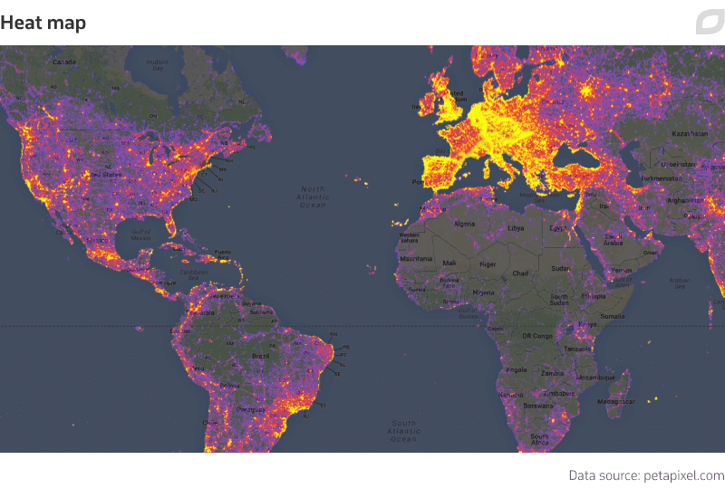
Heat map
Color-coded data points are superimposed on a layout, such as a geographical map, a football field, or a website page. The intensity of the color (from cool to warm) represents the value progression.
When to use?
When you have one data category (clicks on a particular website area, sales deals, population size, hotel check-ins in a particular area, etc.) and a wide value range. Heatmaps are pretty straightforward. Once the data is laid out, it’s easy to see overall and specific trends, spot weak points, and identify hidden opportunities.
In case of website analytics, heatmaps are great for both evaluating page usability and running A/B testing before tweaking any elements or applying a new design.
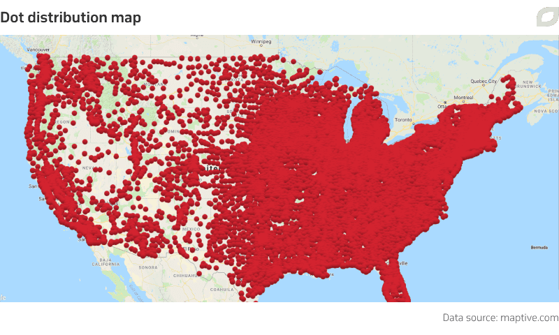
Dot distribution map
It’s a variation of the bubble or scatter plots, where markers are overlaid onto a geographic map in place of certain locations. Each marker is an observation. Similar to bubble plots, markers can be of different sizes, which introduces an additional value or represents a cluster of too densely located dots.
When to use?
When you intend to map a phenomenon that changes smoothly over time, like demographics, voting results, or business growth. Note that in case dots are too numerous for a limited area, it will be difficult to read the map.
Big data visualization techniques
Big data provokes businesses to leave their technological comfort zones and find new ways of data visualization. While big data can be visualized in the ways described above, you can try more sophisticated techniques and tools to address these major big data challenges:
- Size, or processing massive amounts of data and presenting it in a way that is meaningful and not overwhelming
- Variety, or unifying and visualizing unstructured data
- Speed, or accessing and processing data that comes to the company at different speed
Technique 4. Box and whisker plot
Box and whisker plots visualize data with five statistics: minimum, lower quartile, median, upper quartile, and maximum. The lower quartile (25th percentile) is the lower edge of the box; the upper quartile (75th percentile) is the upper edge of the box; the median (50th percentile) is a central line dividing the box into sections. Outliers are represented by whiskers extending from the boxes.
When to use?
Box and whisker plots take up the challenge of representing big data volumes. They are usually used to see and understand data outliers. When you deal with a normal data size, it’s not that difficult to see outliers which usually make up from one to five percent of the whole data set. However, when you deal with billions of data rows, you also deal with millions of outlier data points. In this case, whisker plots would be your graph of choice.
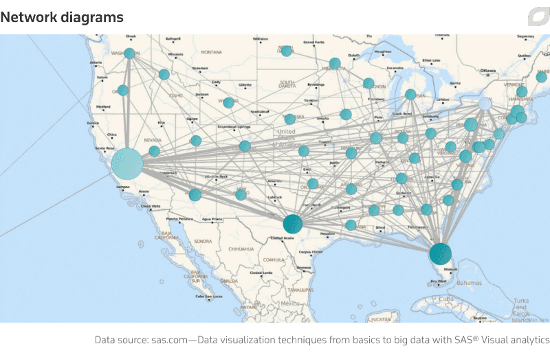
Technique 5. Word clouds and network diagrams
Word clouds are visualizations where word sizes represent their frequency of use—the bigger the size, the more frequently the word is used. Some visualization tools can organize words into topics that can be clicked and further explored.
Box and whisker plots take up the challenge of representing big data volumes. They are usually used to see and understand data outliers. When you deal with a normal data size, it’s not that difficult to see outliers which usually make up from one to five percent of the whole data set. However, when you deal with billions of data rows, you also deal with millions of outlier data points. In this case, whisker plots would be your graph of choice.
When to use?
These two techniques successfully deal with unstructured data. Word clouds are great for tracking the sentiment behind any kind of content, from comments on Twitter to the overall attitude to your brand on the web.
Network diagrams are excellent for tracking any kind of relationship between data sets, such as sales in different areas, customers’ interactions with the brand on social media, etc.
Technique 6. Correlation matrix
A correlation matrix is a table that identifies relationships between variables by combining big data and fast response times. Each cell represents the relationship between two variables. Darker colors point at a stronger correlation, while lighter colors denote weaker correlations. In many visualization tools, it’s possible to click on or hover over any box in the matrix to access more details.
When to use?
When you want to keep track of the data coming to you at different times and monitor how different variables correlate with each other.
Technique 7. Decision tree
Decision, or classification, trees consist of branches, where a branch is a group of strongly related input and target values. ‘Strongly related’ means that when an input value is known, it improves the ability to predict the target value.
Decision trees display which variables are the most influential and which factors make them so. The next branch is the second most important factor, and so on. This way, data is segmented according to the branch points, which considerably refines data analysis.
When to use?
When you need to analyze how a phenomenon behind a large data set is influenced by multiple factors and understand the phenomenon’s possible outcomes. For example, when you have several strategies and need to pick the one with the most favorable outcome.
Decision trees are widely used as the basis for classification algorithms in data mining and machine learning.
Already off to visualize?
Say no more! Visualizing your data is both exciting and challenging. There are few things as satisfying as transforming millions of data rows into beautiful and meaningful graphs. What’s more, visualizations can be interpreted by almost anyone—a data science degree is not a must here.
However, with so many visualization techniques, it’s easy to opt for the one that will end up useless. So, before you pick any technique, study your data types and identify the goals the data is best for. The most fitting use case for any visualization is the presentation of your data analytics in an efficient and easy-to-digest way that drives successful decisions within the shortest time possible.
When it comes to big data, you can visualize it with simple methods, like bar charts or scatter plots, but also be ready for brand new challenges that, most probably, will force you adapt new technologies.
